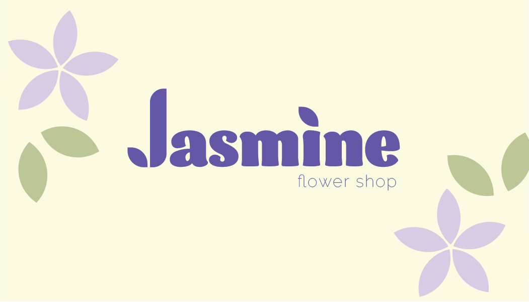
The stationary visual system for Jasmine Flower Shop is designed to be used in business and marketing deliverables. The design of the logo and the patten are inspired by the petal of a jasmine flower, which holds a lot of meaning to the brand's identity. The play on the “J” in Jasmine highlights an abstract flower petal, while the dot on the “i” carries the same icon to unify the logo. The color palette is feminine and clean, with the contrasting primary and secondary colors of purple and cream.